> ## Documentation Index
> Fetch the complete documentation index at: https://docs.subframe.com/llms.txt
> Use this file to discover all available pages before exploring further.
# Props & slots
> Add data and composition to your components.
Properties make your components reusable by accepting different data. There are four types:
* **Text / Number** — Simple text or numeric values
* **Icon** — Icon selection from available icon libraries
* **Image** — Image URLs or uploaded files
* **Slot** — Regions for dynamic content and composition
When using component instances, properties can be configured in the inspector.
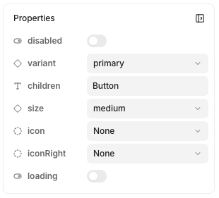 Text, icon, and image props are for simple data. Slots are special properties that allow for composition—see [dedicated section](#slots) below.
## Creating a new property
1. Ensure you have nothing selected in design mode
2. On right-hand panel, click **Properties** >
3. Select the property type to add
You can also create a property when [linking](/learn/components/props-and-slots#linking-element-contents-to-a-property) elements.
## Removing properties
1. Ensure you have nothing selected in design mode
2. Look for your property under **Properties**
3. Click on the to delete
## Linking element contents to a property
Text, icon, and image props are for simple data. Slots are special properties that allow for composition—see [dedicated section](#slots) below.
## Creating a new property
1. Ensure you have nothing selected in design mode
2. On right-hand panel, click **Properties** >
3. Select the property type to add
You can also create a property when [linking](/learn/components/props-and-slots#linking-element-contents-to-a-property) elements.
## Removing properties
1. Ensure you have nothing selected in design mode
2. Look for your property under **Properties**
3. Click on the to delete
## Linking element contents to a property
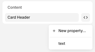 1. Click on the element
2. In inspector, click **Content** >
3. Select the property or **New Property...** to create a new one
## Slots
Slots expose a region of your component as a prop. They're useful for:
* **Reusability & composition** — Add dynamic content like elements and other components within others
* **Adding interactions in code** — Let developers add business logic within your components. See [adding interactive logic](/guides/component-docs) for more.
#### Adding slots
1. Create a stack
2. In the inspector, click **Slot** >
3. Name your slot, click **Create**
You can also right-click or press / to open [quick actions](/learn/design-mode/quick-actions), then select **Add slot**.
#### Using slots
1. Click on the element
2. In inspector, click **Content** >
3. Select the property or **New Property...** to create a new one
## Slots
Slots expose a region of your component as a prop. They're useful for:
* **Reusability & composition** — Add dynamic content like elements and other components within others
* **Adding interactions in code** — Let developers add business logic within your components. See [adding interactive logic](/guides/component-docs) for more.
#### Adding slots
1. Create a stack
2. In the inspector, click **Slot** >
3. Name your slot, click **Create**
You can also right-click or press / to open [quick actions](/learn/design-mode/quick-actions), then select **Add slot**.
#### Using slots
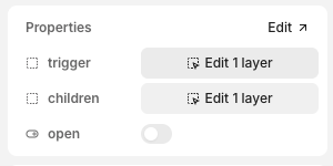 1. Insert a component instance
2. In inspector, look for the slot property and click **Edit X layers**
Within the canvas, you can also double-click any contents within a slot to edit.
#### Previewing slots
When viewing component docs, components in slots are exposed in the properties panel. You can edit these component props in the preview to test how your component handles different configurations.
1. Insert a component instance
2. In inspector, look for the slot property and click **Edit X layers**
Within the canvas, you can also double-click any contents within a slot to edit.
#### Previewing slots
When viewing component docs, components in slots are exposed in the properties panel. You can edit these component props in the preview to test how your component handles different configurations.