> ## Documentation Index
> Fetch the complete documentation index at: https://docs.subframe.com/llms.txt
> Use this file to discover all available pages before exploring further.
# Variants
> Create different visual styles for your component.
Variants let you create different visual styles for your component.
## How variants work
Every component has a **default variant**—how it looks with no changes applied.
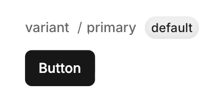 You can add variants to override styles. There are two types:
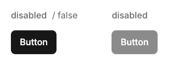
* **Boolean** — True or false (e.g. `disabled`)
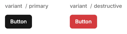
* **Enum** — Multiple options (e.g. `variant` with primary, secondary, destructive)
Each variant only stores style overrides from the default—not the full design. When multiple variants are active, they layer together automatically.
For example, a button with `disabled` and `variant=destructive` variants:
* `disabled` changes opacity to 50%
* `destructive` changes background to red
When both are active, you get a red button at 50% opacity.
You can add variants to override styles. There are two types:
* **Boolean** — True or false (e.g. `disabled`)
* **Enum** — Multiple options (e.g. `variant` with primary, secondary, destructive)
Each variant only stores style overrides from the default—not the full design. When multiple variants are active, they layer together automatically.
For example, a button with `disabled` and `variant=destructive` variants:
* `disabled` changes opacity to 50%
* `destructive` changes background to red
When both are active, you get a red button at 50% opacity.
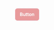 By defining each variant separately, you don't need to design every combination—just define what each variant changes.
## Creating a variant
1. Ensure you have nothing selected in design mode
2. On right-hand panel, click **Properties** >
3. Select the type of variant to add
## Adding options to an enum variant
1. Ensure you have nothing selected in design mode
2. On right-hand panel, find the enum to add an option to
3. Click to add an option
## Modifying styles in a variant
1. Select the variant you want to modify
2. Select an element
3. Modify any property in the Inspector
4. An override indicator (pink dot) appears next to the property
By defining each variant separately, you don't need to design every combination—just define what each variant changes.
## Creating a variant
1. Ensure you have nothing selected in design mode
2. On right-hand panel, click **Properties** >
3. Select the type of variant to add
## Adding options to an enum variant
1. Ensure you have nothing selected in design mode
2. On right-hand panel, find the enum to add an option to
3. Click to add an option
## Modifying styles in a variant
1. Select the variant you want to modify
2. Select an element
3. Modify any property in the Inspector
4. An override indicator (pink dot) appears next to the property
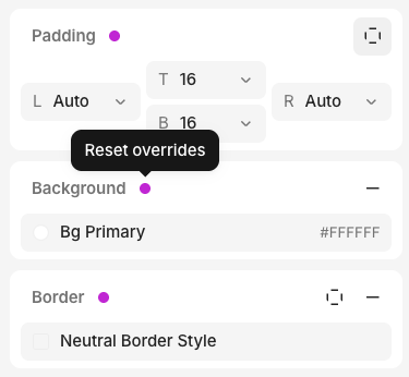 To remove a variant override, click the pink dot to reset to the default value.