> ## Documentation Index
> Fetch the complete documentation index at: https://docs.subframe.com/llms.txt
> Use this file to discover all available pages before exploring further.
# Importing tokens
> Import design tokens from Tailwind config, CSS, or JSON files to set up your theme.
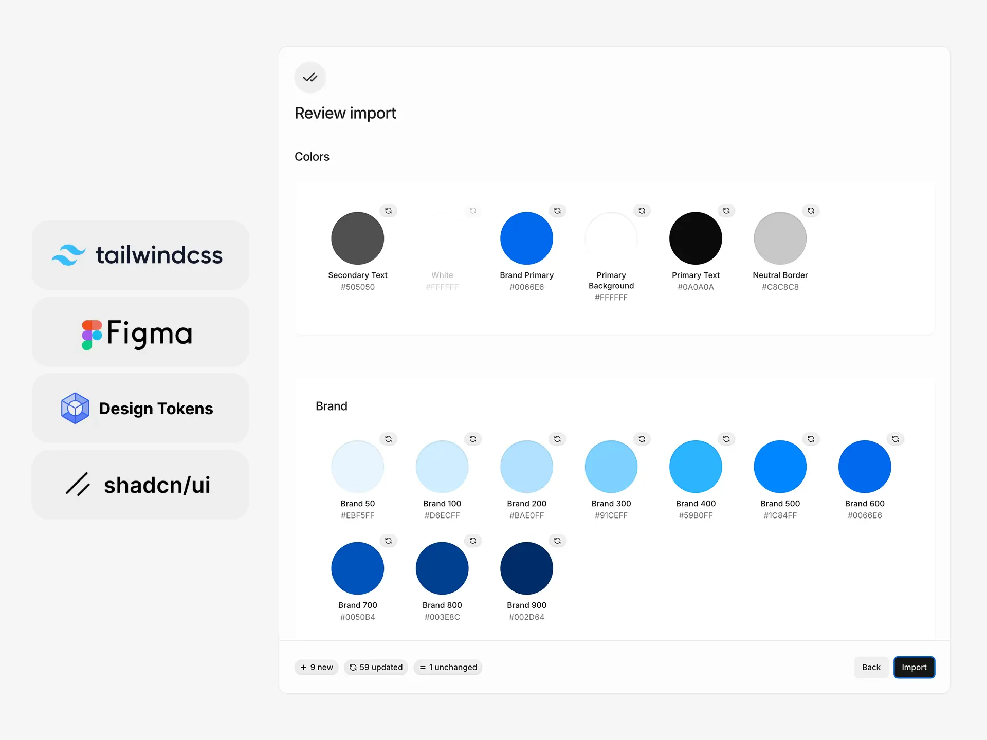
Import design tokens from your existing design system into Subframe. The theme importer supports Tailwind CSS (v3 and v4), CSS variables, and JSON files — including Figma design token exports.
 ## Supported formats
Subframe supports the following theme formats for import:
Paste or upload `.css` files containing `@theme` blocks with CSS custom properties:
```css theme={null}
@theme {
--color-brand-500: #3b82f6;
--color-brand-600: #2563eb;
--color-neutral-100: #f5f5f5;
}
.dark {
--color-brand-500: #60a5fa;
--color-brand-600: #3b82f6;
--color-neutral-100: #1f1f1f;
}
```
Subframe detects Tailwind v4 syntax automatically from `.css`, `.scss`, or `.less` files. Tokens declared inside a `.dark { }` block are imported as dark-mode values for their matching light tokens. Importing dark-mode tokens enables dark mode on your current theme automatically — see [Dark mode](/guides/dark-mode). Files with only a `.dark { }` block are also supported.
Paste or upload `.js`, `.ts`, `.mjs`, or `.cjs` config files:
```js theme={null}
module.exports = {
theme: {
extend: {
colors: {
brand: {
500: '#3b82f6',
600: '#2563eb',
},
},
},
},
}
```
Subframe parses the `theme.extend.colors` object from your config.
Paste CSS custom properties directly:
```css theme={null}
--color-primary-100: #eeeeee;
--color-primary-200: #dddddd;
--color-primary-300: #cccccc;
```
Color values can be hex, rgb, hsl, or modern CSS color syntax like `oklch()`, `lab()`, and `color()`. Wide-gamut colors (such as Display P3) are converted to the closest sRGB value.
Upload a `.json` file containing design tokens, following the W3C Design Tokens Format. This works with Figma's **variables** export.
Subframe reads color values and token structure from the JSON.
## Import your theme
Go to the **Theme** page and select **Import** from the sidebar.
Add your tokens by uploading or pasting:
* **Upload files:** Drag and drop or browse for files. Multiple files supported.
* **Code editor:** Click **Tailwind CSS (v4)** or **Tailwind CSS (v3)** to paste CSS or JavaScript directly. The editor provides syntax highlighting and detects the format automatically.
Subframe parses your input and shows a preview of detected tokens. Each token shows its status:
* **New** — token will be added to your theme
* **Updated** — token matches an existing token name and will update its value
* **Unchanged** — token already exists with the same value
When your imported tokens reference other variables (e.g. `var(--color-brand-500)`), Subframe automatically maps these as **aliases** — references to other tokens rather than hard-coded values. Aliases can reference other tokens in the same import or existing tokens in your theme. If a referenced variable can't be resolved, it's converted to a direct color value.
If your input includes dark-mode tokens, the preview shows the light and dark palettes side by side so you can review both before importing.
Click **Import** to update your theme. New tokens appear immediately in your theme, organized into folders matching the structure of your import. Use **Version History** to revert your import.
## Importing from Figma
You can export your Figma variables as design tokens and import them directly into Subframe:
1. Open **Variables** in your Figma file
2. Right-click on a collection and select **Export modes**
3. Open the ZIP file to see the JSON files for each mode's tokens
4. Upload the JSON file in the **Import** dialog in Subframe
You can upload multiple JSON files from different collections at once.
### Limitations:
* Subframe currently supports a single mode. Import one mode (e.g. light OR dark), not both.
* Figma does not export text styles as variables. Use a Figma plugin to export text tokens separately, or add text styles manually in your theme.
## Troubleshooting
Verify your file format:
* CSS files should contain `--` prefixed custom properties with valid color values — hex, rgb, hsl, or modern syntax like `oklch()` and `color()`
* Tailwind configs should export a `theme.extend.colors` object
* JSON files should contain color values in a supported design token format
* Remove preprocessor-specific syntax (Sass variables, Less mixins) before importing
Tokens with the same name as existing tokens in your theme are marked as updates. Rename the token in the preview step if you want to add it as a new token instead.
Alias references (e.g. `var(--color-brand-500)`) only resolve against other imported tokens or existing tokens in your theme. If the target token doesn't exist in either, the alias is converted to a direct color value.
## Supported formats
Subframe supports the following theme formats for import:
Paste or upload `.css` files containing `@theme` blocks with CSS custom properties:
```css theme={null}
@theme {
--color-brand-500: #3b82f6;
--color-brand-600: #2563eb;
--color-neutral-100: #f5f5f5;
}
.dark {
--color-brand-500: #60a5fa;
--color-brand-600: #3b82f6;
--color-neutral-100: #1f1f1f;
}
```
Subframe detects Tailwind v4 syntax automatically from `.css`, `.scss`, or `.less` files. Tokens declared inside a `.dark { }` block are imported as dark-mode values for their matching light tokens. Importing dark-mode tokens enables dark mode on your current theme automatically — see [Dark mode](/guides/dark-mode). Files with only a `.dark { }` block are also supported.
Paste or upload `.js`, `.ts`, `.mjs`, or `.cjs` config files:
```js theme={null}
module.exports = {
theme: {
extend: {
colors: {
brand: {
500: '#3b82f6',
600: '#2563eb',
},
},
},
},
}
```
Subframe parses the `theme.extend.colors` object from your config.
Paste CSS custom properties directly:
```css theme={null}
--color-primary-100: #eeeeee;
--color-primary-200: #dddddd;
--color-primary-300: #cccccc;
```
Color values can be hex, rgb, hsl, or modern CSS color syntax like `oklch()`, `lab()`, and `color()`. Wide-gamut colors (such as Display P3) are converted to the closest sRGB value.
Upload a `.json` file containing design tokens, following the W3C Design Tokens Format. This works with Figma's **variables** export.
Subframe reads color values and token structure from the JSON.
## Import your theme
Go to the **Theme** page and select **Import** from the sidebar.
Add your tokens by uploading or pasting:
* **Upload files:** Drag and drop or browse for files. Multiple files supported.
* **Code editor:** Click **Tailwind CSS (v4)** or **Tailwind CSS (v3)** to paste CSS or JavaScript directly. The editor provides syntax highlighting and detects the format automatically.
Subframe parses your input and shows a preview of detected tokens. Each token shows its status:
* **New** — token will be added to your theme
* **Updated** — token matches an existing token name and will update its value
* **Unchanged** — token already exists with the same value
When your imported tokens reference other variables (e.g. `var(--color-brand-500)`), Subframe automatically maps these as **aliases** — references to other tokens rather than hard-coded values. Aliases can reference other tokens in the same import or existing tokens in your theme. If a referenced variable can't be resolved, it's converted to a direct color value.
If your input includes dark-mode tokens, the preview shows the light and dark palettes side by side so you can review both before importing.
Click **Import** to update your theme. New tokens appear immediately in your theme, organized into folders matching the structure of your import. Use **Version History** to revert your import.
## Importing from Figma
You can export your Figma variables as design tokens and import them directly into Subframe:
1. Open **Variables** in your Figma file
2. Right-click on a collection and select **Export modes**
3. Open the ZIP file to see the JSON files for each mode's tokens
4. Upload the JSON file in the **Import** dialog in Subframe
You can upload multiple JSON files from different collections at once.
### Limitations:
* Subframe currently supports a single mode. Import one mode (e.g. light OR dark), not both.
* Figma does not export text styles as variables. Use a Figma plugin to export text tokens separately, or add text styles manually in your theme.
## Troubleshooting
Verify your file format:
* CSS files should contain `--` prefixed custom properties with valid color values — hex, rgb, hsl, or modern syntax like `oklch()` and `color()`
* Tailwind configs should export a `theme.extend.colors` object
* JSON files should contain color values in a supported design token format
* Remove preprocessor-specific syntax (Sass variables, Less mixins) before importing
Tokens with the same name as existing tokens in your theme are marked as updates. Rename the token in the preview step if you want to add it as a new token instead.
Alias references (e.g. `var(--color-brand-500)`) only resolve against other imported tokens or existing tokens in your theme. If the target token doesn't exist in either, the alias is converted to a direct color value.