

Adding an interaction
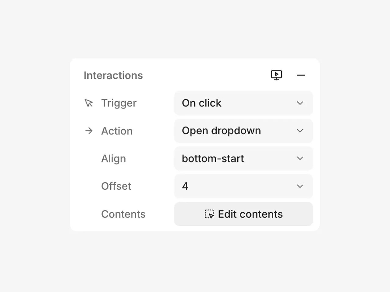
- Select the element you want to make interactive.
- In the inspector, find the Interactions section and click the + icon.
- Choose a trigger, an action, and configure the destination or alignment.
Triggers and actions
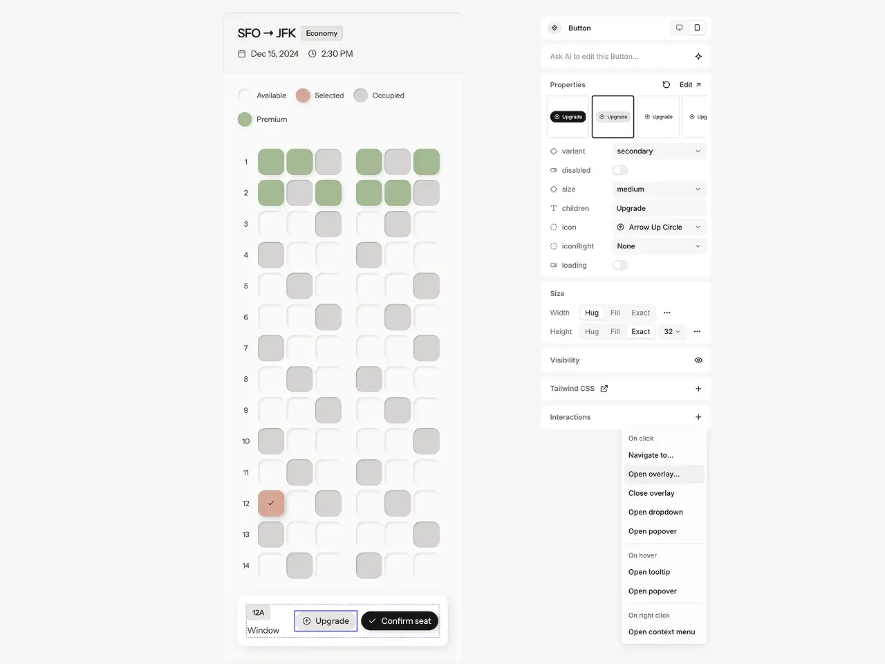
On click
- Navigate to… — Opens a different page.
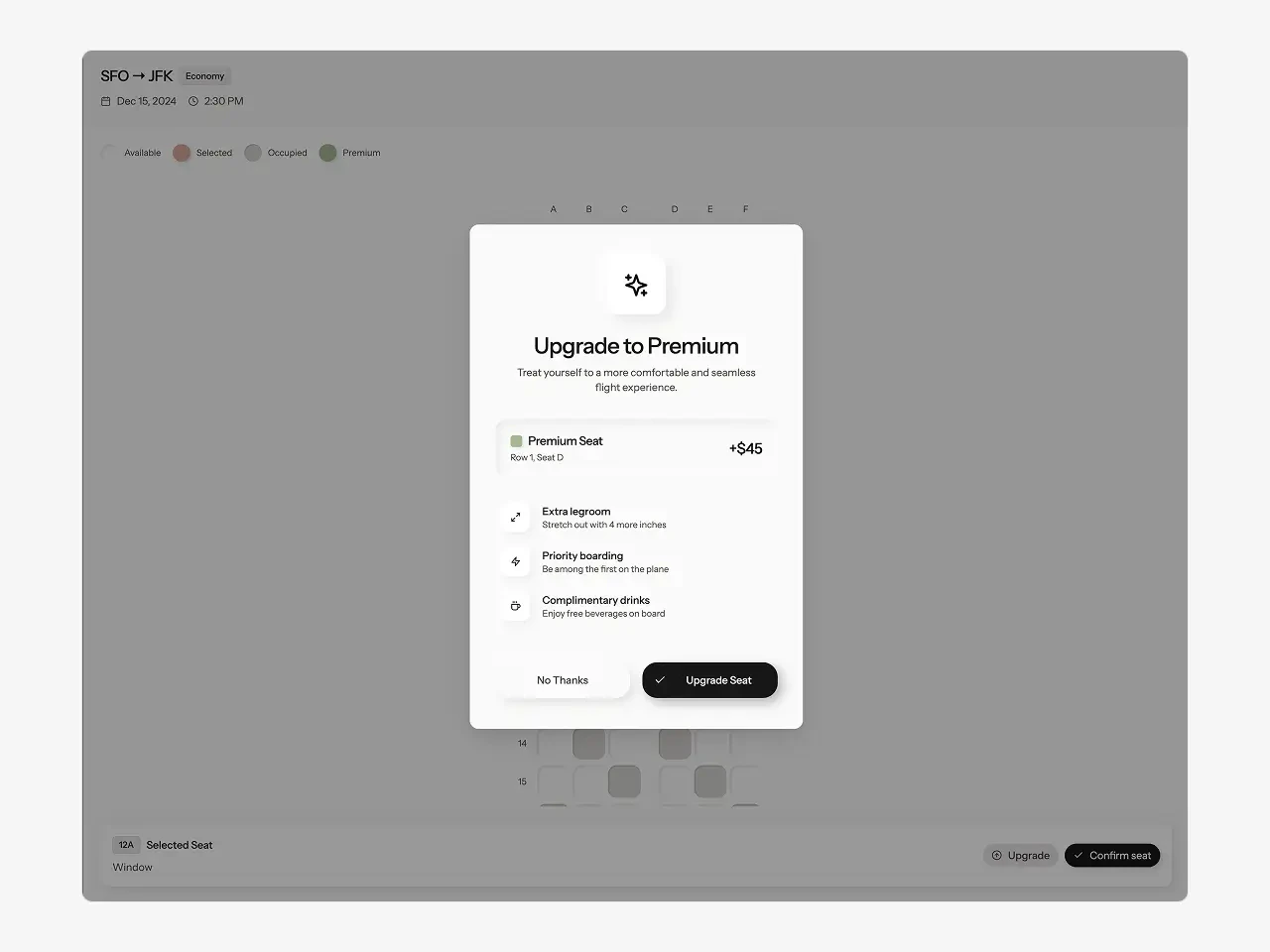
- Open overlay… — Opens a page as an overlay (dialog or drawer) on top of the current page.
- Close overlay — Closes the currently open overlay.
- Open dropdown — Opens a dropdown menu anchored to the element.
- Open popover — Opens a popover with custom contents anchored to the element.
Tip: Make sure pages opened as an overlay use a dialog or drawer layout to render properly over the existing page.
On hover
- Open tooltip — Shows a tooltip on hover.
- Open popover — Shows a popover on hover with custom contents.
On right click
- Open context menu — Opens a context menu at the cursor position.
Editing popover and overlay contents
Click Edit contents to open the popover, tooltip, dropdown, or context menu contents in the editor. Design the contents the same way you would any other element on a page. For overlays, select the destination page and design it using a dialog or drawer layout.Previewing interactions
Limitations
- Each element supports one interaction. You cannot stack multiple triggers (e.g. on hover + on click) on the same element. Wrap elements in stacks with different interactions instead.
- Preview interactions are separate from Prototype mode. In the future, interactions will automatically feed into AI-generated prototypes as prompt annotations.
- Click-through prototypes are best for simple navigation flows, opening overlays, and testing popover behavior. For complex interactions like form handling, state management, and dynamic data, use Prototype with AI.