

- Same as code — Components in Subframe are the same building blocks your engineers use
- Always in sync — When you update a component, all instances update and sync to code
- Interactive when needed — Some components like checkboxes and accordions have built-in interaction logic using
@subframe/core, our Radix-based headless component library. Learn more about headless components.
Importing components
We recommend importing your theme first so that imported components match your design system.- From code
- From Figma
- Open Components under Design System in the left sidebar
- Click New component
- Paste the source code of an existing component from your codebase into the prompt
- Press Enter or click the send button — the AI agent will take a few minutes to import your component
Example prompt
Example prompt
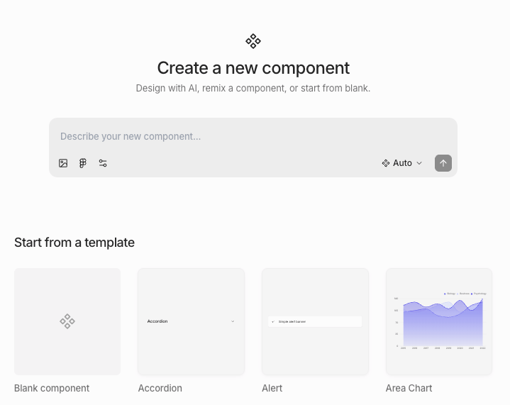
Creating components using AI
- Open Components under Design System in the left sidebar
- Click New component
- Describe the component you want in the prompt
- Press Enter or click the send button — the AI agent will take a few minutes to create your component
Creating components from scratch
- Open Components under Design System in the left sidebar
- Click New component
- Choose one of:
- Remix an existing prebuilt component
- Create from scratch
Some prebuilt components are based off of Radix primitives. If you want interactive logic like checked state, you must
remix an existing prebuilt component.
Creating components from existing designs
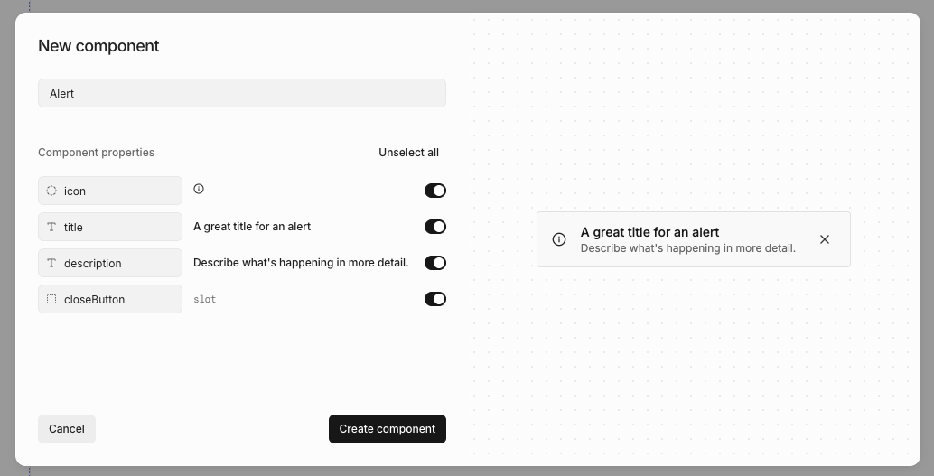
- Right-click or press / to open quick actions
- Select Create component
- Name your component
- Review AI-suggested properties
- Click Create
Editing components
To edit a component:- Open Components under Design System in the left sidebar
- Click on the component
- Click Edit component
- Right-click or press / to open quick actions
- Select Edit component
Adding component instances
You can add a component instance by- Open the quick insert menu
- Select the component you want to add
Detaching component instances
You can detach a component so the rendered elements are no longer linked to the component.- Right-click or press / to open quick actions
- Select Detach instance
Components whose structure relies on tightly coupled primitives — dropdowns, selects, dialogs, drawers, charts,
tables, and calendars — can’t be detached. The Detach component action is hidden for these.
Deleting components
You can delete a component from the Components page or from the … menu in the component editor. When a deleted component is used in other designs, Subframe handles existing instances based on the component type. The delete dialog shows what will happen before you confirm:- Instances will be detached — Custom components and most interactive primitives (buttons, switches, checkboxes, sliders, sidebars, navbars). Each instance becomes an independent copy of the rendered elements.
- Instances will be deleted — Components whose structure can’t survive on their own (dropdowns, selects, dialogs, drawers, charts, tables, calendars). Customizations inside each instance are removed with it.
- Layout assignments will be cleared — Page layouts. The pages using the layout stay, but lose their layout assignment.
- References will be removed — Custom pages referenced from prototype actions or other pages.
Resetting components
You can reset a prebuilt component to its original state, reverting any customizations you’ve made.- Right-click or press / to open quick actions
- Select Reset to original
- Confirm the reset
Sorting components
The Components page lists every component in your project along with when each was last edited. Use the sort control at the top of the list to change the order:- A-Z — Alphabetical by name (default)
- Recently edited — Most recently edited first
- Recently created — Most recently created first
Component docs
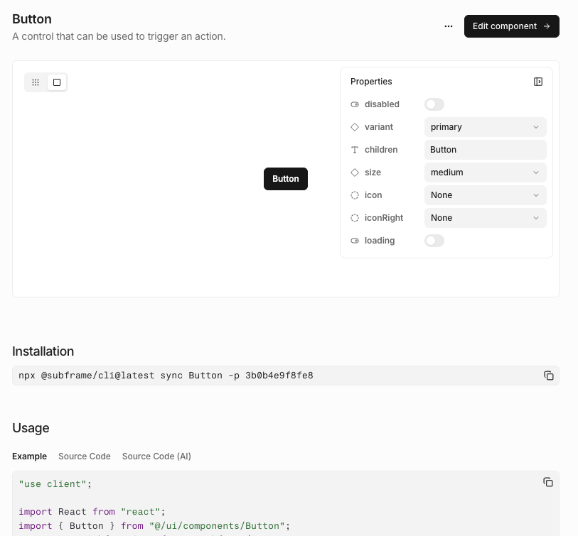
Exporting components to code
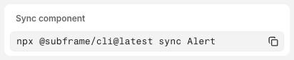
- Click Code
- Select Inspect
- Copy and paste the
npx @subframe/cli@latestcommand
Importing from another project
Copy components and pages from one of your other Subframe projects into the current one. Each selection brings along the dependencies it needs to render — nested components, theme tokens, fonts, custom icons, and image assets.- Open Components under Design System in the left sidebar
- Click Import from… (top right) and select Another project
- Pick the source project from the dropdown
- Browse or search the source project’s components and pages — click any item to preview it on the right
- Check the box on each item you want, then click Import
Components that already exist in the current project don’t appear in the picker.