

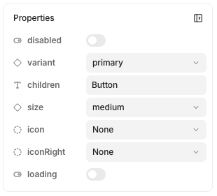
- Text / Number — Simple text or numeric values
- Icon — Icon selection from available icon libraries
- Image — Image URLs or uploaded files
- Slot — Regions for dynamic content and composition
Creating a new property
- Ensure you have nothing selected in design mode
- On right-hand panel, click Properties >
- Select the property type to add
Removing properties
- Ensure you have nothing selected in design mode
- Look for your property under Properties
- Click on the to delete
Linking element contents to a property
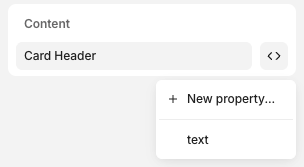
- Click on the element
- In inspector, click Content >
- Select the property or New Property… to create a new one
Slots
Slots expose a region of your component as a prop. They’re useful for:- Reusability & composition — Add dynamic content like elements and other components within others
- Adding interactions in code — Let developers add business logic within your components. See adding interactive logic for more.
Adding slots
- Create a stack
- In the inspector, click Slot >
- Name your slot, click Create
Using slots
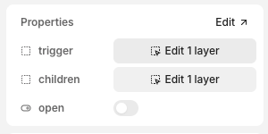
- Insert a component instance
- In inspector, look for the slot property and click Edit X layers