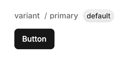
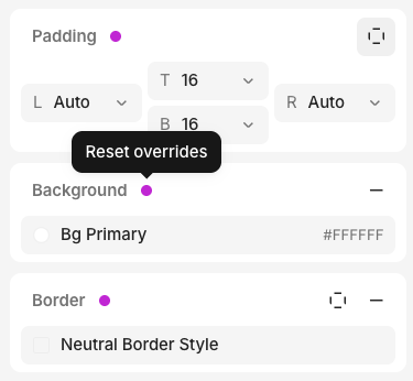
Every component has a default variant—how it looks with no changes applied.
You can add variants to override styles. There are two types:
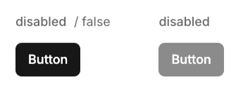
Boolean — True or false (e.g. disabled)
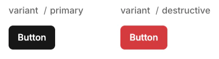
Enum — Multiple options (e.g. variant with primary, secondary, destructive)
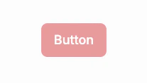
Each variant only stores style overrides from the default—not the full design. When multiple variants are active, they layer together automatically.For example, a button with disabled and variant=destructive variants:
disabled changes opacity to 50%
destructive changes background to red
When both are active, you get a red button at 50% opacity.
By defining each variant separately, you don’t need to design every combination—just define what each variant changes.