Overrides properties
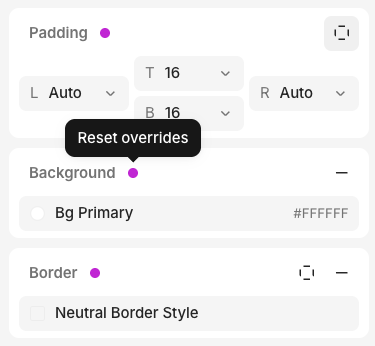
Overrides let you customize properties for specific contexts without changing the base element. There are two types of overrides:- Responsive overrides — breakpoint overrides for properties that need different values at specific screen sizes
- Variant overrides — different values for component instances
Prebuilt interactive components
The inspector lets you set the default state for some prebuilt components, so you can preview how they look in different conditions:- Checkbox, Switch, Radio Group item, Toggle Group item — toggle the Checked prop
- Text Field, Text Area — type into the Value prop
Keyboard shortcuts
Most properties in the inspector have a keyboard shortcut. Hover over any edit action to see its shortcut.